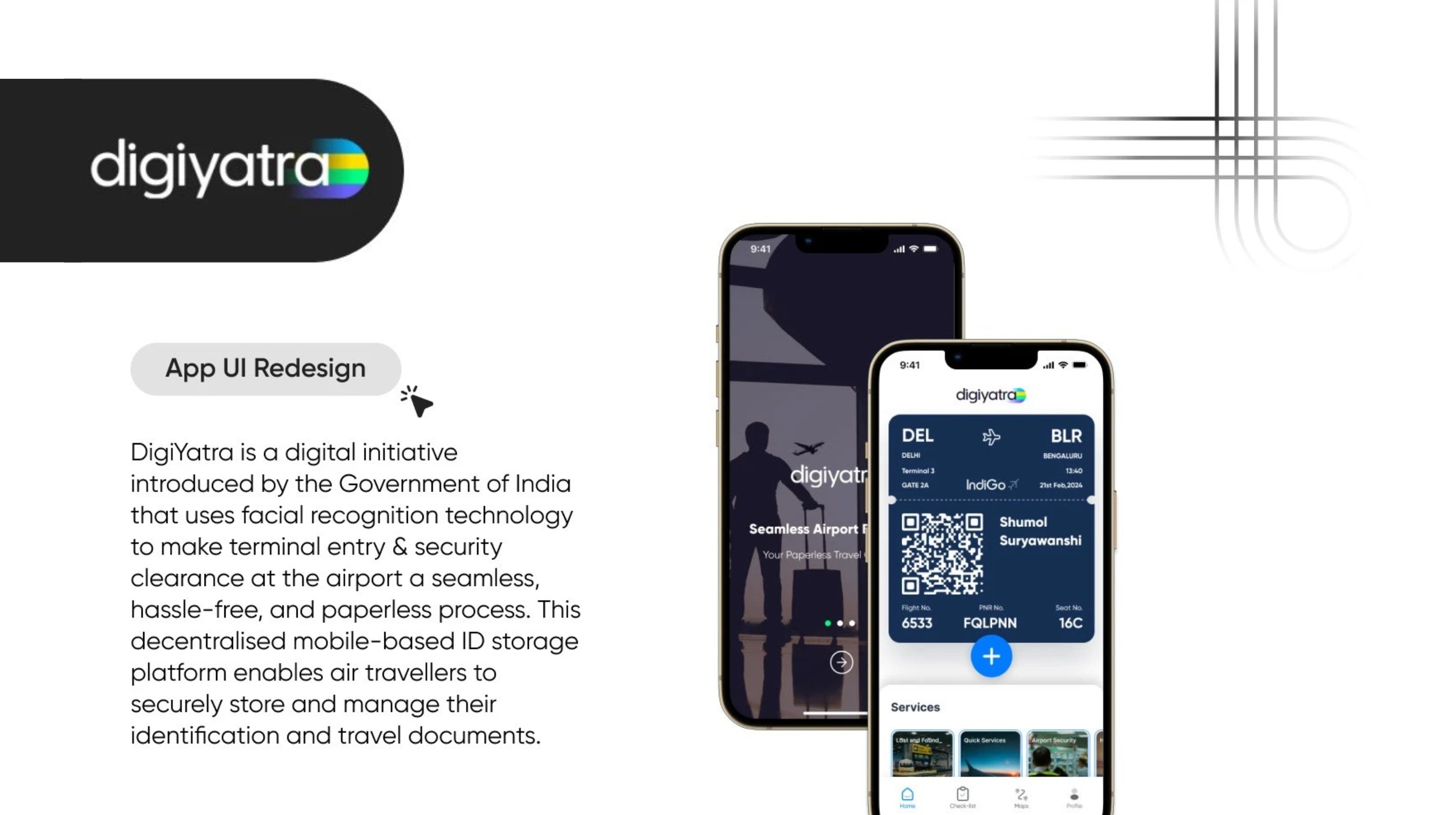
DigiYatra
A full UI/UX redesign of the DigiYatra mobile app, enhancing system feedback, information architecture, and interface consistency to deliver a frictionless and trustworthy biometric travel experience.
UI/UX Design · Product Redesign
Project Overview
Project Type: UI/UX Design
Focus: Mobile App Redesign & User Experience
Industry: Travel Tech / Government Initiative
Year: 2024
Overview
DigiYatra is a biometric-based airport entry system that enables paperless travel through facial recognition. While the initiative promises a seamless airport experience, the existing app lacked clarity in onboarding, verification, and navigation — creating friction during time-sensitive travel moments.
This project reimagines the app with a focus on usability, structured information architecture, and system feedback to improve trust and task confidence.
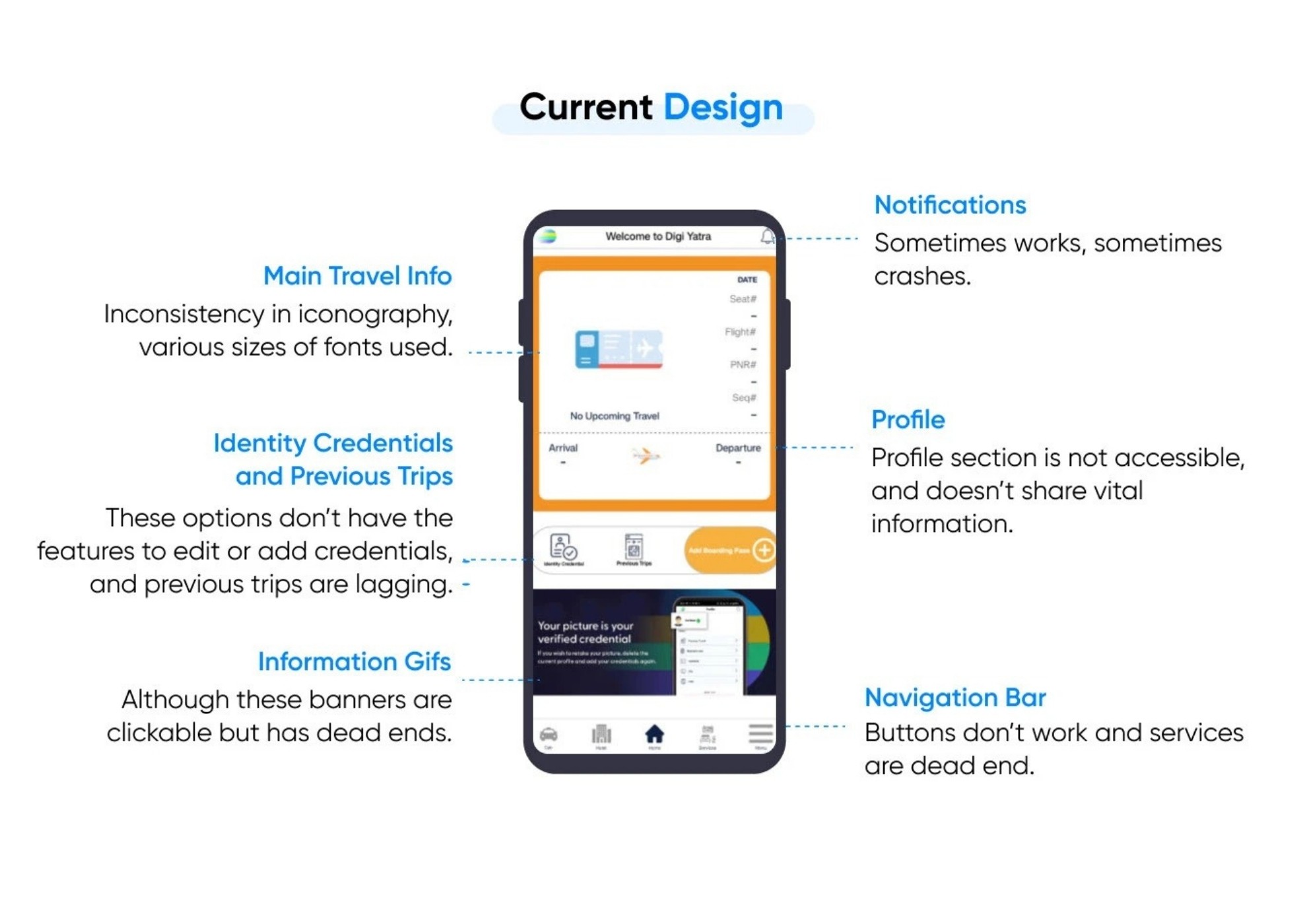
The Challenge
Airport environments are high-pressure and time-sensitive. The app needed to:
Provide clear system status during identity verification
Ensure QR access is immediate and reliable
Reduce confusion in navigation and feature discovery
Support both frequent and occasional flyers
Improve accessibility and error recovery
The primary challenge was reducing uncertainty in a biometric workflow.
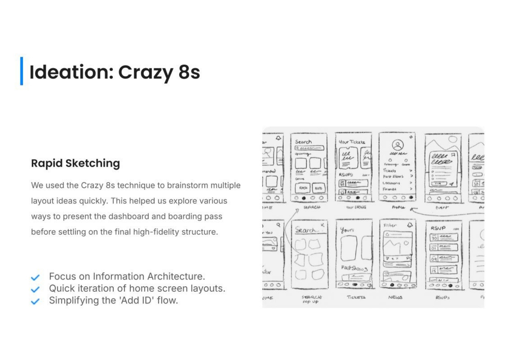
Research & Key Insights
A structured audit of the existing experience revealed:
Lack of visible progress indicators during onboarding
Inconsistent UI patterns and typography
Poor prioritization of high-frequency actions
Limited error feedback and recovery guidance
Accessibility gaps in contrast and hierarchy
These insights informed both structural and interface-level changes.
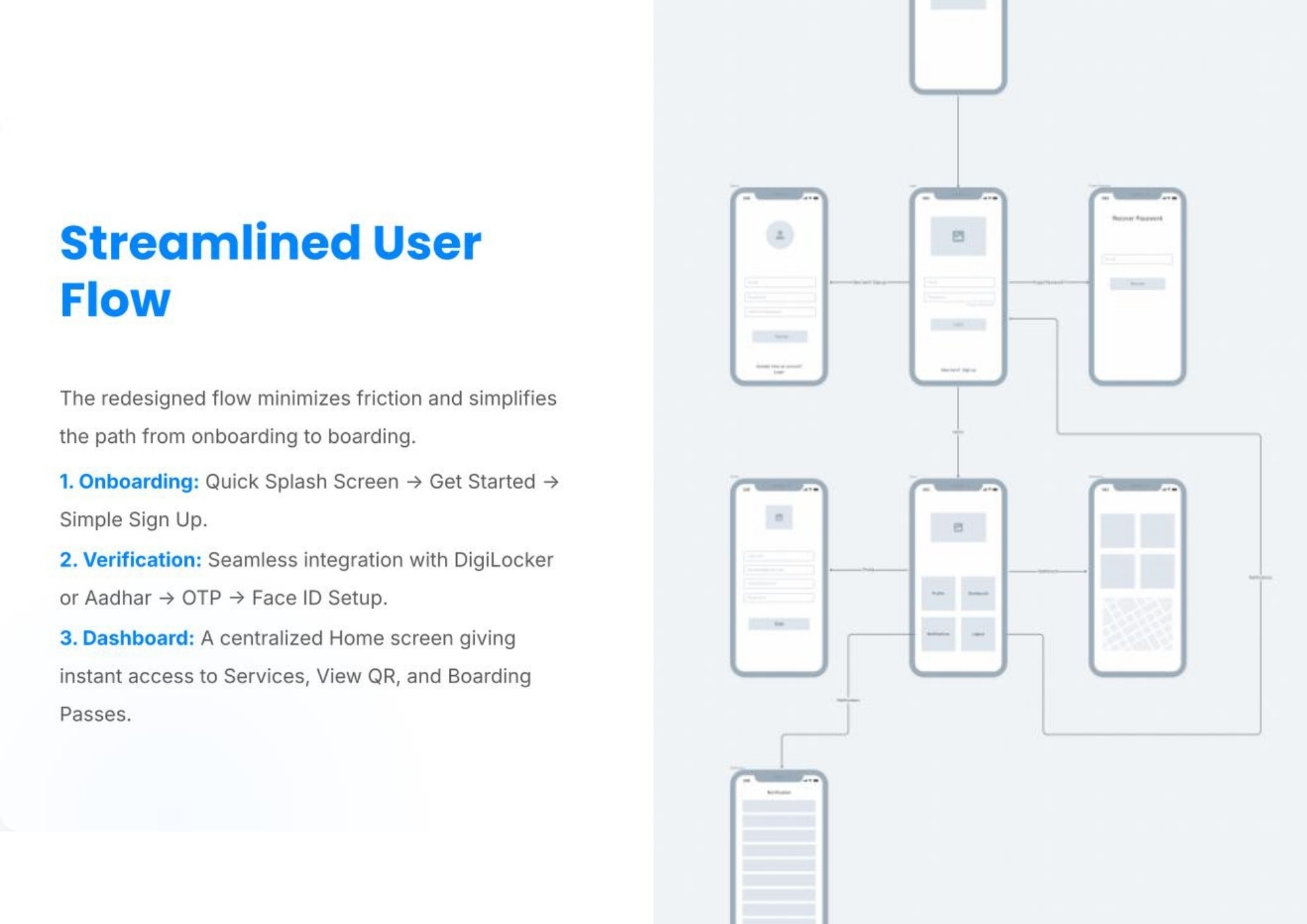
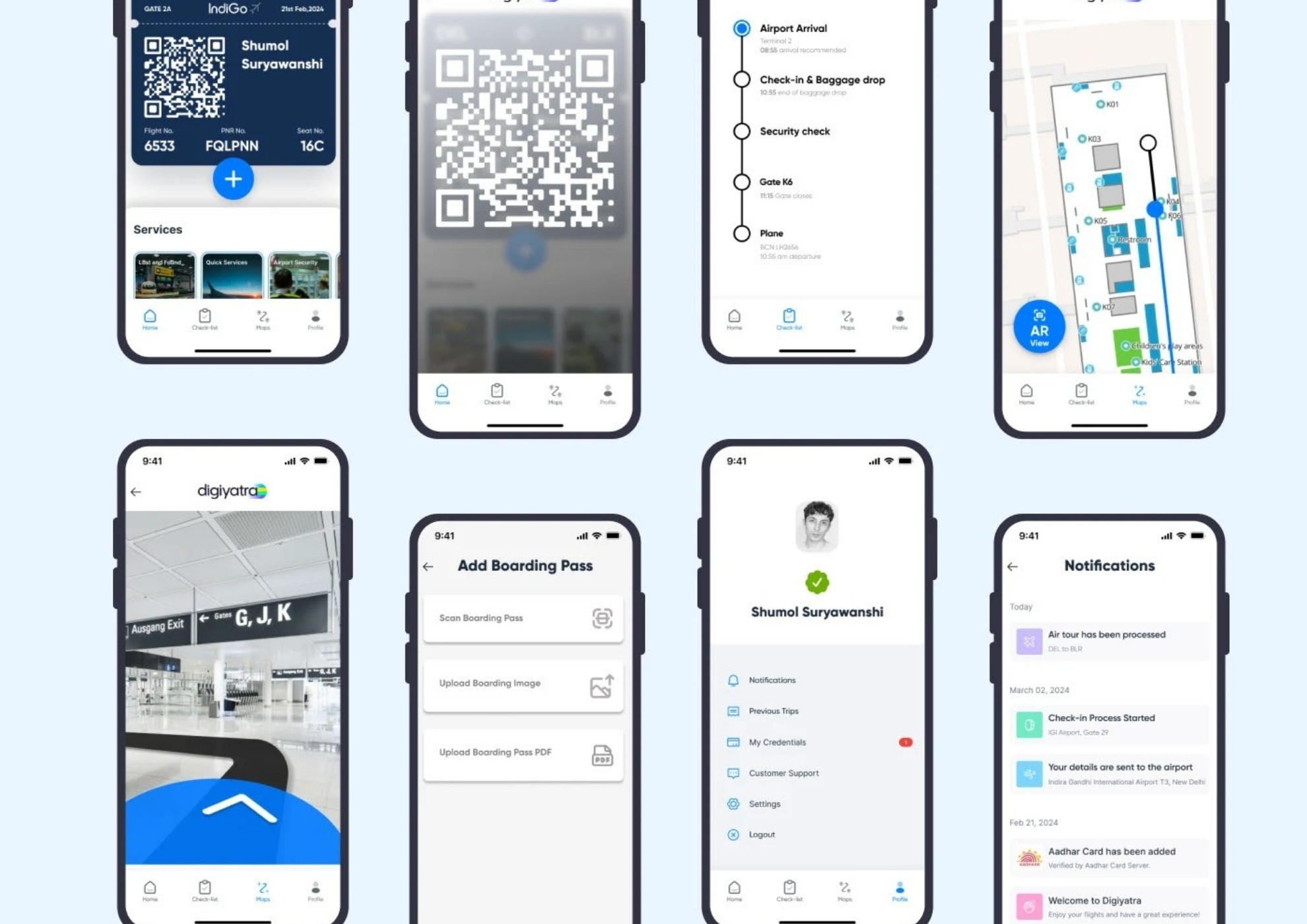
Information Architecture
The app structure was reorganized to prioritize critical user actions:
Quick-access QR on the home screen
Clear, step-based onboarding flow
Dedicated sections for Trips, Credentials, Support, and Settings
Simplified navigation hierarchy to reduce cognitive load
The redesigned flow minimizes friction from account setup to boarding.
UX & Interaction Improvements
Introduced clear progress indicators during verification
Strengthened visual hierarchy for readability
Replaced ambiguous error states with actionable guidance
Established consistent component behavior
Optimized primary navigation for faster task completion
The focus shifted from visual refresh to functional clarity.
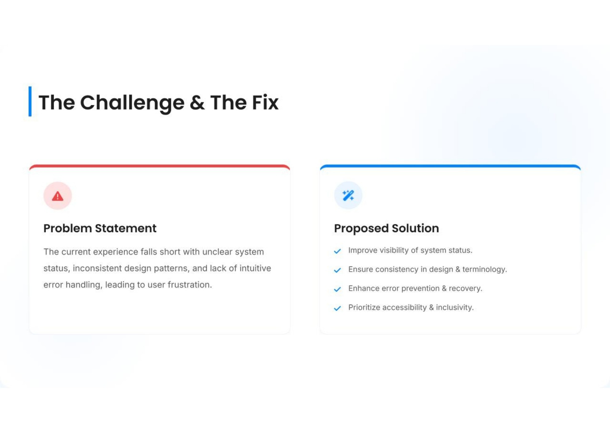
Solution
The redesigned interface delivers:
A structured onboarding and Aadhaar verification journey
Immediate QR visibility for airport access
Centralized trip management
Integrated customer support access
A consistent, scalable visual system
The result is a calmer and more predictable airport companion.
Outcome
The redesigned experience improves task clarity, reduces onboarding friction, and increases confidence during airport interactions.
By prioritizing system visibility and information structure, the app transitions from reactive to reliable — a critical shift for biometric travel technology.
View the full project on Behance.